

 By
By Introduction
Have you ever seen a Halloween poster that gave you chills before you even read the words? Or an invitation that instantly felt mysterious and fun? That feeling often comes from the letters themselves. A freaky font can completely change the mood of your design. Whether you are making a Halloween party invite, a haunted house flyer, or a ghost story website, the style of your text matters more than you think.
In this guide, you will learn what makes spooky typography work, how to choose the right style, and how to use it without hurting readability. Everything is explained in simple steps so you can apply it right away in your projects. Let’s explore how to turn plain text into something thrilling.
What is a Freaky Font?
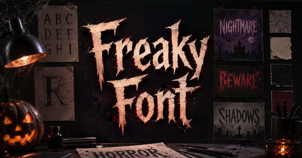
A freaky font is a decorative typeface that looks spooky, scary, or strange. It often has uneven letters, sharp edges, or dripping effects. These design details help create a creepy mood.
Some common features include:
- Jagged or broken lines
- Dripping “blood” effects
- Rough, scratched textures
- Uneven letter spacing
- Gothic or old-style shapes
When people search for a freaky font, they usually want something that fits Halloween, horror movies, haunted houses, or scary stories. The goal is to create an atmosphere before the reader even understands the words. For example, compare a clean school-style font with a dark, twisted one. The clean one feels safe and normal.
The twisted one feels mysterious or even dangerous. That emotional reaction happens in seconds. This is why designers use a freaky font mainly for headlines, titles, and short phrases. It grabs attention fast.
Why Spooky Typography Works So Well
Our brains react quickly to shapes. Sharp angles and uneven lines can make us feel alert. Smooth and round shapes feel calm and friendly. Scary-looking letters often have sharp or messy shapes. That makes them feel tense.
When someone sees that tension in text, they expect something dramatic or thrilling. This trick is often used in movies. Horror posters almost never use simple business fonts. They use dramatic, dark letter styles to match the story.
A well-chosen freaky font helps:
- Set the mood instantly
- Make designs more memorable
- Increase excitement for events
- Improve visual storytelling
In 2026, more designers are mixing spooky styles with modern layouts. Instead of making everything messy, they keep the design clean but let the headline carry the creepy vibe. This balance makes designs both scary and easy to read.
Where You Can Use a Freaky Font
Spooky typography works best in creative and themed projects. It is not made for school essays or business reports. It shines in fun and dramatic settings.
Here are popular uses:
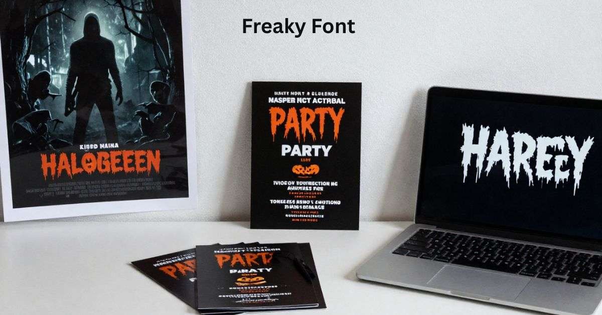
- Halloween Invitations: A themed letter style makes the invite feel like part of the party.
- Horror Movie Posters: The title font tells viewers what kind of story to expect.
- Haunted House Flyers: Bold and eerie letters grab attention from far away.
- Ghost Story Websites: A strong header sets the mood for readers.
- YouTube Thumbnails: Creepy text helps horror videos stand out in search results.
When used correctly, a freaky font makes people curious. Curiosity makes them want to read more or click.
How to Choose the Right Style
Not all spooky fonts are the same. Some are playful. Others are very dark and intense. Before picking one, ask yourself three simple questions:
Who is the audience?
Children’s Halloween events need fun, cartoon-like spooky letters. Styles that are darker can be used for adult horror.
Where will it appear?
A poster can handle bold distortion. A small mobile screen needs clearer shapes.
How much text will you use?
Decorative fonts work best for short text, not long paragraphs.
Below is a helpful comparison to guide your choice.
Choosing the Right Spooky Style
| Project Type | Best Style Type | Avoid Using |
| Kids’ Halloween Party | Cartoon spooky letters | Gore or blood-drip styles |
| Horror Movie Poster | Distressed or sharp serif | Soft, rounded school fonts |
| Haunted Attraction Sign | Gothic or cracked texture | Thin, hard-to-read scripts |
| Social Media Graphic | Bold, high-contrast design | Very detailed tiny lettering |
Choosing the right freaky font depends on mood and clarity. Always test your design before printing or posting.
Keep It Readable and Clear
One big mistake is using a spooky font for everything. When every word looks wild, the message becomes hard to understand. Good design uses contrast. This means mixing styles in a smart way.
For example:
- Use a freaky font for the title.
- Use a clean, simple font for the details.
This makes the headline exciting while keeping the information easy to read.
Also remember:
- Use strong color contrast between text and background.
- Avoid very thin letters on dark backgrounds.
- Leave space around the text so it can “breathe.”
Even the creepiest design should still be clear.
Best Tools to Find and Use Spooky Fonts in 2026
There are many platforms where you can download and test horror-style fonts.
Popular choices include:
- Google Fonts (limited spooky styles but safe to use)
- DaFont (many creative options, check licenses)
- Creative Market (premium, high-quality fonts)
- Envato Elements (great for designers)
You can edit and customize these fonts using:
- Canva for simple designs
- Adobe Illustrator for advanced editing
- Figma for website projects
Many tools in 2026 now include AI text effects. You can add texture, glow, smoke, or glitch effects with one click. This makes your freaky font look even more dramatic. Just remember to check if the font is free for commercial use before selling designs.
Pairing Spooky Fonts with Colors and Effects
Color plays a big role in how scary your design feels. Dark backgrounds often make text stand out more. Popular color combinations in 2026 include:
- Black and deep red
- Dark purple and silver
- Midnight blue and pale grey
- Burnt orange and charcoal
Textures also help. Light grain or cracked overlays can make a clean font look older and creepier. Here is a simple comparison to show how design choices change the mood.
Clean vs Spooky Typography
| Design Element | Clean Style | Spooky Style |
| Letter Shape | Smooth and even | Jagged or uneven |
| Color Choice | Light background, dark text | Dark background, bold colors |
| Texture | None | Grain, cracks, or drips |
| Mood | Friendly and calm | Tense and mysterious |
Even a simple phrase can feel dramatic with the right freaky font and dark color theme.
Common Mistakes to Avoid
Using spooky typography is fun, but small errors can ruin your design. One mistake is choosing a font that is too detailed. Small cracks and drips may look cool up close but become blurry from far away. Another mistake is using too many decorative fonts together. Mixing two or three dramatic styles creates confusion.
Stick to one main decorative typeface and one clean partner font. Also, avoid stretching or squeezing letters too much. This can make them look unprofessional. A well-chosen freaky font should look intentional, not messy.
2026 Trends in Spooky Typography
Design trends change every year. In 2026, designers are moving towards “subtle spooky” styles. Instead of extreme blood effects, many creators use minimal but eerie letter shapes. Animated text is also very popular. Short videos on social media use moving shadows, flickers, or glitch effects to add tension. Another trend is combining modern layouts with gothic lettering.
The mix of old and new creates a fresh look. Custom lettering is rising too. Designers create their own version of a freaky font by editing base fonts and adding texture. This makes branding more unique. If you want your design to stand out, try adding soft motion or small texture effects instead of going over-the-top.
Simple Step-by-Step Guide to Using a Freaky Font
- Start by choosing your main headline text. Keep it short and powerful.
- Next, pick a spooky typeface that matches your theme. Test it in a large size first.
- After that, add a clean font for the extra details like date, time, or description.
- Choose a dark color palette. Make sure the writing is easy to read.
Finally, review your design on both desktop and mobile screens. If it is easy to read and still feels dramatic, you did it right. Using a freaky font is about mood, not confusion.
FAQs
Where can I download a freaky font for free?
You can find many on DaFont and FontSpace, but always check the license.
Can I use a freaky font for body text?
It is better to use it only for headlines and short titles.
Are spooky fonts good for business logos?
Only if the brand theme is horror, Halloween, or entertainment.
How do I make text look more creepy?
You can add dark colors, texture layers, and soft shadows.
Do these fonts work on mobile screens?
Yes, but test them carefully to keep the text readable.
Conclusion
Typography is more powerful than most people realize. The right letter style can change how someone feels in just a second. A carefully chosen freaky font can turn a simple design into something exciting, mysterious, and unforgettable. The key is balance. Headlines should have big, bold letters. Details should be easy to see, and the colors should fit the mood. Look at your design from a range of angles and on a number of screens. Make sure it feels spooky but still easy to read.
If you are planning a Halloween party, designing a horror poster, or building a ghost story website, try experimenting with a freaky font today. Start small, test your ideas, and see how much atmosphere you can create just by changing the letters. Your next design might be the one that truly gives people chills.